
Clinched
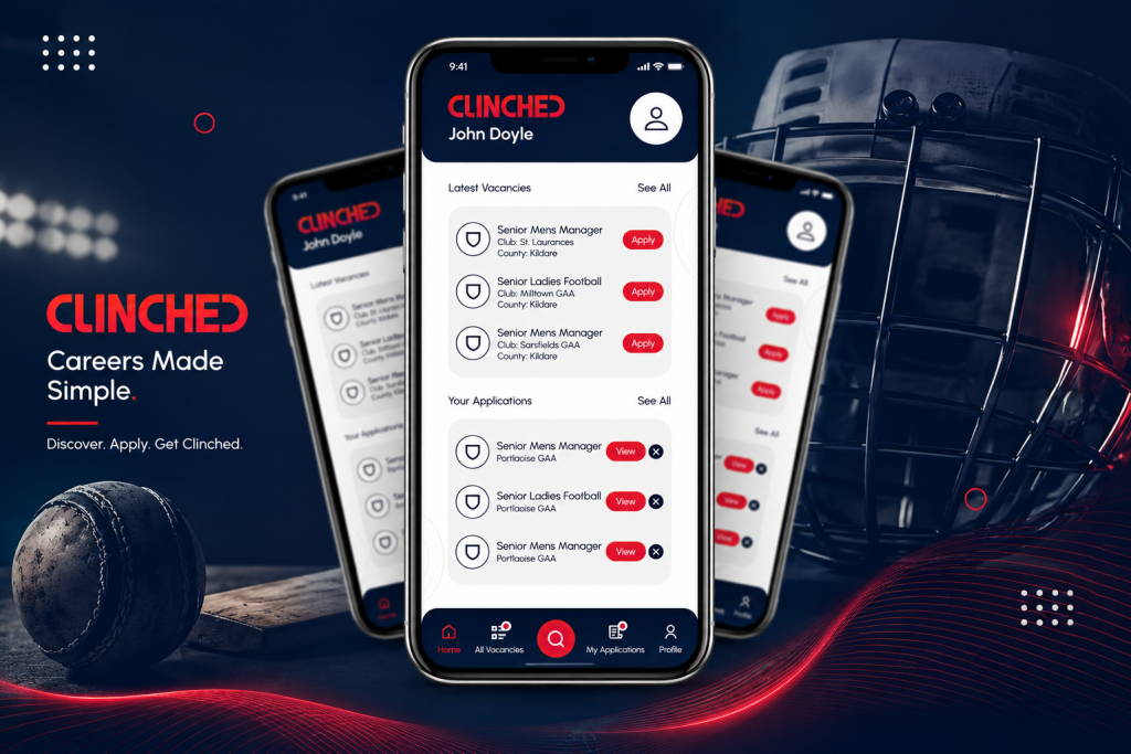
Premium mobile app showcase blending modern technology with a dynamic sports-inspired design, highlighting the Clinched app’s intuitive UI and seamless user experience.
Create seamless, responsive digital experiences designed for mobile users and built to strengthen your brand’s online presence.
In an increasingly handheld world, we craft captivating digital experiences that resonate with your audience. Ensuring smooth delivery of digital assets across platforms, devices, and screens.
We help businesses tap into the growing mobile-first market by delivering seamless, integrated experiences across devices through our expertise and capabilities.
The digital solutions we create for our clients are constructed to handle millions of simultaneous interactions across platforms, all the while ensuring blazing-fast service delivery. By leveraging cutting-edge technologies and frameworks, we create digital solutions offering consistent and cohesive experiences.
If there is one thing that is critical to your success with the mobile-first audience, it is the loading speed of your website, app, or any other digital offerings. Our expert team uses advanced techniques such as code minification, image compression, and efficient caching strategies to skyrocket your loading times and responsiveness across devices and networks.
Apart from a cutting-edge development team, we have the best designers and graphic engineers that construct not just interfaces but experiences for your users to love and cherish.
We empower businesses with tailored mobile-first solutions that meet the evolving needs of today’s digitally connected consumers.
Premium mobile app showcase blending modern technology with a dynamic sports-inspired design, highlighting the Clinched app’s intuitive UI and seamless user experience.
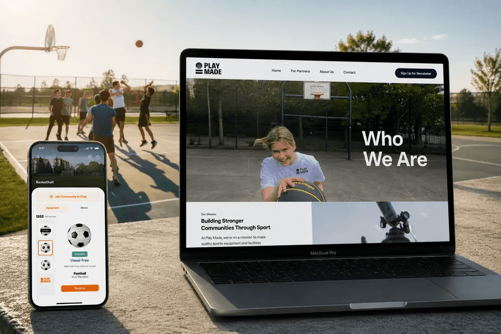
PlayMade started when our founders noticed something: cities were full of parks and courts, but people had no easy way to find equipment, check availability, or connect with others who wanted to play.
Meet the tools in the arsenal of our designers, developers, and software engineers, which they use to enhance your service delivery across platforms and devices.
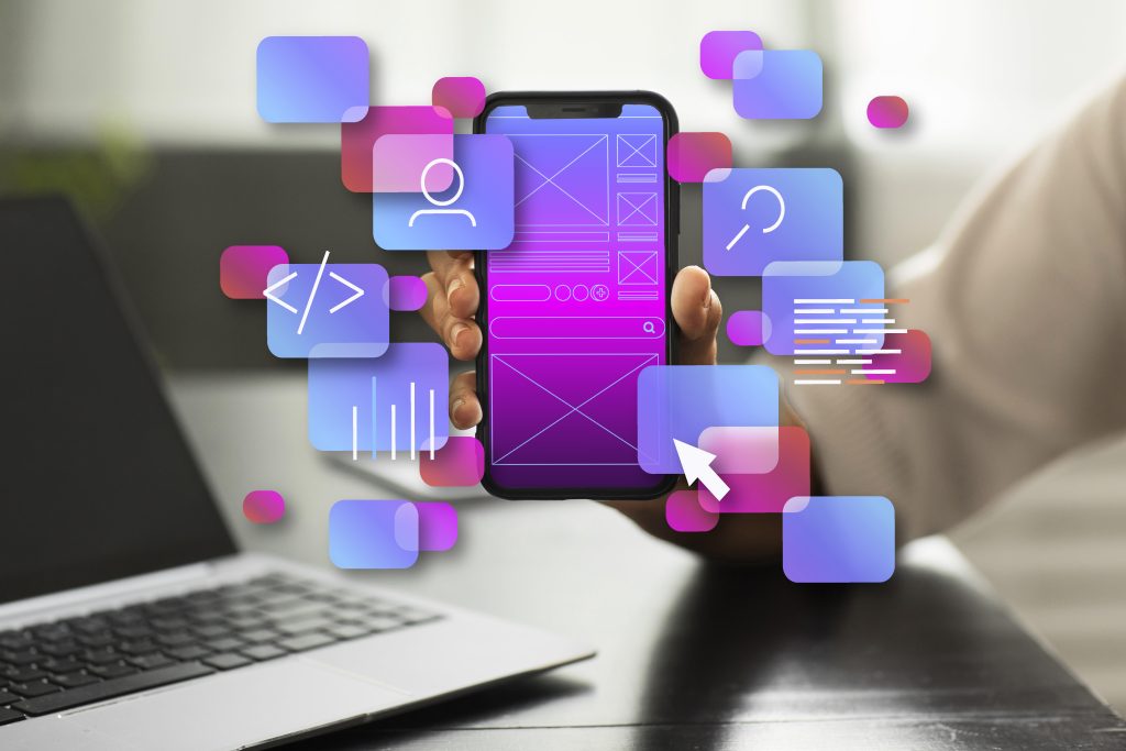
Mobile-first design focuses on creating digital experiences for smartphones first, then scaling them seamlessly to tablets, desktops, and larger screens.
Since most users access websites and applications through mobile devices, mobile-first design helps improve usability, engagement, performance, and overall user experience.
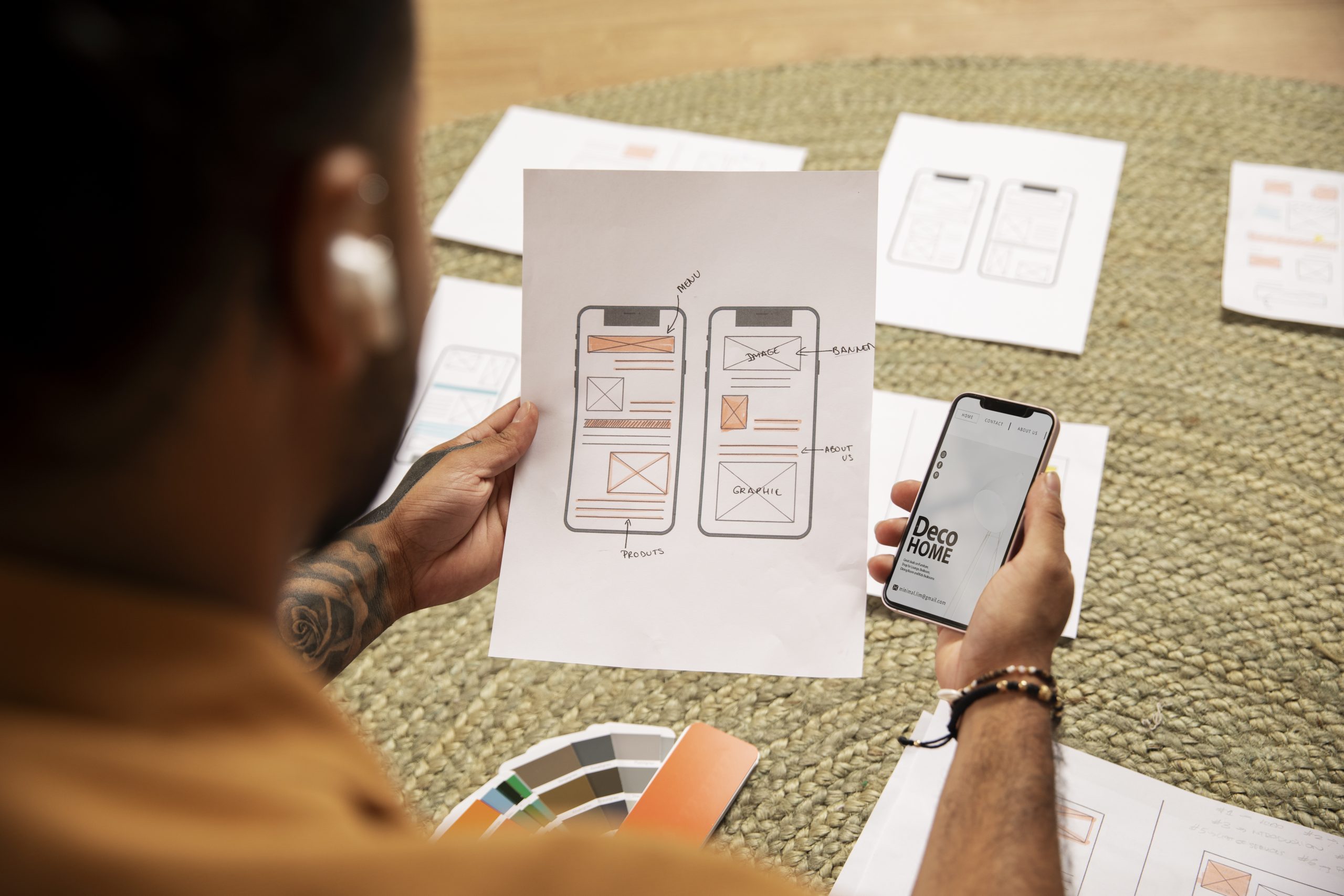
Our process includes UX research, information architecture, wireframing, responsive UI design, prototyping, usability testing, and design optimization for different screen sizes.
Yes. We can audit your existing interface, identify mobile usability issues, and redesign the experience with a responsive, user-focused mobile-first approach.
Yes. We create flexible designs that provide a consistent and optimized experience across smartphones, tablets, laptops, desktops, and other screen sizes.
Tell us about your idea. We'll tell you honestly what it'll take.
Get In Touch With Our Experts